An Icon, Reignited
The Glenlivet stands as a leader in single malt whisky.
Yet even legends must evolve.
CHIC faced a pivotal challenge: to infuse The Glenlivet with fresh visual codes while preserving its iconic essence — the Glenlivet Masterbrand Teal — across all touchpoints. This was our moment to introduce a contemporary luxury mindset, in a category where tradition often remains untouched. The Glenlivet had all the elements for a bold leap forward, and CHIC led from the outset. A singular vision shaped our approach: Reimage The Glenlivet with a modern allure, built to last the next 200 years.

With decades of experience in luxury, and a long-standing partnership with The Glenlivet, CHIC brings cultural depth and editorial precision to the brand. This luxury fluency informed every creative decision.
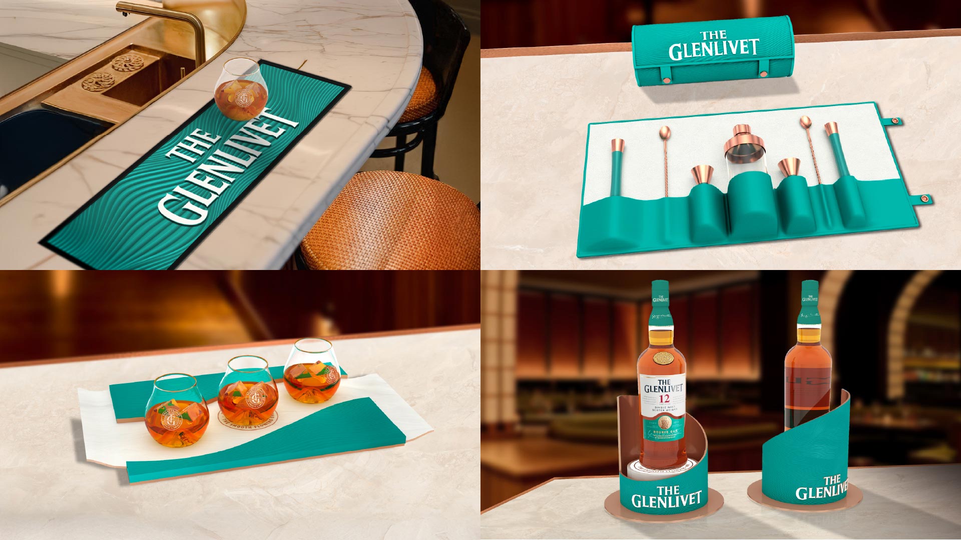
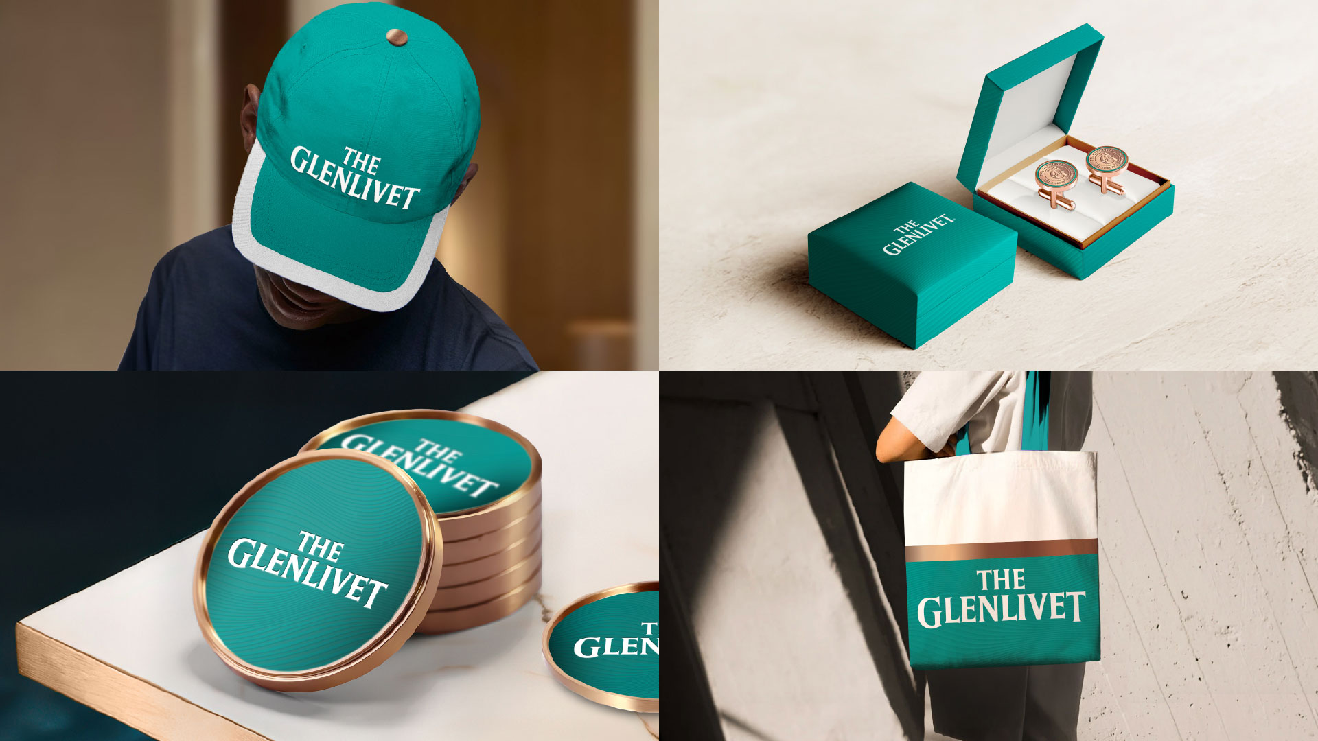
CHIC reimagined The Glenlivet’s visual language through movement, meaning, and modernity.
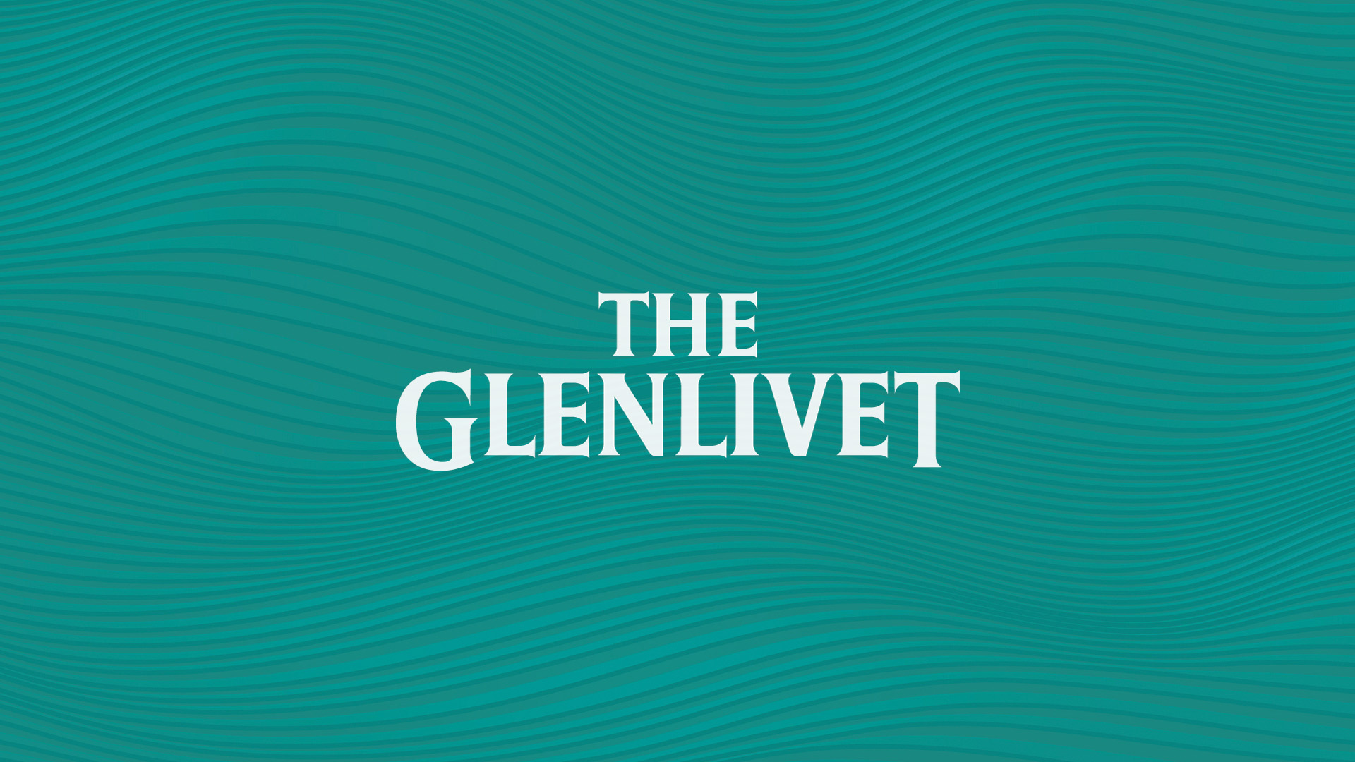
At the heart: the Masterbrand Teal — a rich, textured colour drawn from the River Livet.
Paired with a refined graphic system and elevated retail guidelines, it tells the story of Speyside’s original single malt with elegance and clarity.
A new signature. Distinctive. Enduring. Undeniably The Glenlivet.
With their spot at the top of worldwide best-selling single malt brands, The Glenlivet's reach is wide and varied. Speaking to consumers across every touchpoint, be that physical or digital, retail or campaign is paramount.
When working on an expansion of The Glenlivet's digital assets, enabling accessibility alongside elevated design was CHIC's focus. The resulting suite of static and animated deliverables seamlessly places The Glenlivet in the palm of the hand. Originality, for all.
Refresh the codes. Keep the story.
At CHIC, evolution is always intentional.